After 20 Years, Walmart debuts a fresh logo: What it means for the Brand
For the first time in 20 years, Walmart has updated its logo, featuring bold new colors and a modern design. Learn what this change means for the retail giant’s future.

For the first time in 20 years, Walmart has unveiled a revamped logo to reflect its transformation into a modern, digital-first retailer. The redesign marks a significant shift for the retail giant, symbolizing its commitment to staying relevant in a rapidly evolving marketplace.
The update, which includes changes to the color palette, typography, and the iconic "spark" symbol, aims to capture Walmart’s growth and evolution since its last redesign in 2008. Here’s what the changes entail and how they represent the company’s future vision.
A modern twist on a familiar logo in Walmart
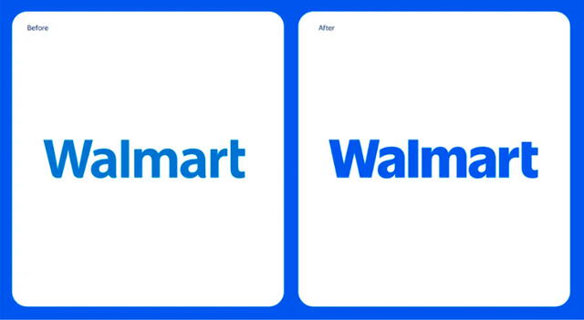
Walmart’s new logo maintains the familiar elements of its branding while introducing subtle but impactful changes. The updated design features a deeper shade of blue, referred to as "True Blue," and a brighter “Spark Yellow” for the company’s iconic spark symbol. This modernized color palette is designed to enhance visibility and align with digital platforms.
The font has also been updated to a bolder, custom typeface inspired by the classic trucker hat worn by Walmart founder Sam Walton, giving the logo a fresh yet nostalgic feel. Additionally, the yellow spark symbol has been refined with broader stems, making it more prominent and visually appealing.
The rationale behind the redesign
According to William White, Walmart’s U.S. Chief Marketing Officer, the redesign reflects the retailer’s evolution over the past two decades. White emphasized that Walmart is no longer the same company it was in 2008, highlighting advancements in e-commerce, digital innovation, and customer experience.

The new logo change for Walmart across the United States. Photo: Walmart.
The updated branding symbolizes Walmart’s efforts to stay ahead of industry trends while continuing to serve its diverse customer base. The goal is to convey a message of modernization and growth while staying true to Walmart’s core values of accessibility and affordability.
The refreshed logo began appearing in select physical stores in October 2024 and will continue to roll out across Walmart’s platforms, including its website, mobile app, and marketing materials, throughout 2025. This gradual implementation ensures a seamless transition for customers and employees.
While the changes may seem subtle, Walmart’s branding te am believes the new design will resonate with both longtime customers and a younger, digitally-savvy audience.
